Friends, I’m going to talk about Microsoft and I may even say some nice things, so please don’t shun me.
Microsoft recently revealed its first logo upgrade in 25 years. While it’s not a huge change from the four-color box logo we’ve grown accustom to for Windows, it is sleeker and simpler. Here’s a short video showing the change.
The logo isn’t mind blowing. For years, the cleaner, four-box mark has been on the Microsoft Store, which I affectionately call the empty Apple Store rip-off place. That aside, the video does show that Microsoft is now being more intentional in connecting its individual product logos to better reflect the parent brand. As it’s launching a bunch of revamped products, colors are more consistent and the new logo font (Segoe) is being used more. Here’s a comparison of the old and the new.
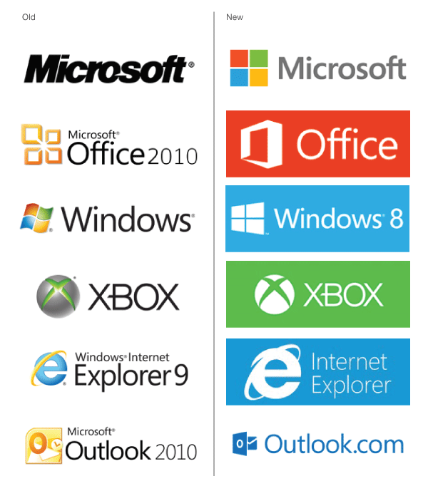
It makes sense. Microsoft says their four-box mark represents its wide variety of products. So why not make things look more consistent with those colors? Their updated operating system, Windows 8, will even have a box driven layout. The brilliance in all of this is, when you look at Microsoft products now, it will be clearer that they are in the same family. Even though Microsoft had brought some product fonts together in the past, now the color palate, along with the main logo font change, makes everything match better. Plus, when you compare the corporate, Windows and Office logos, the treatment on the boxes seem to work with each other.
As churches, we’ve fallen in love with giving everything a logo. Kids’ ministry gets their fun logo and women’s ministry gets something pretty. Every ministry wants its own look. Yet rarely do we extend the effort to make sure they are consistent with our actual church branding. The point isn't to match or to coordinate. The point is to reinforce the main brand.
We need to recognize that logos aren't just interesting images. If they were, we could pick out cute clip art and call it good. Our logos represent our brand, and our brands have value. We need to recognize our church brand is the most central to our mission. Our other brands need to connect back to that central brand so that they are leveraging its value and even generating more value back to the main brand.
In many ways, I’m not the biggest fan of churches having logos for everything. It can be confusing for visitors, it dilutes the actual church brand and in some cases it contributes to the unhealthy building of silos in a church. But if you feel the need to do it, take the time to make sure all the sub-logos look like they are coming from your church. Make sure they can all look good together when they’re all lined up next to one another. When someone looks at the men’s ministry logo, they should be able to identify that it belongs to your church.
Good branding that is consistent takes work. And yes, even if you’re sitting in front of your Mac, there is a lesson to be learned from Microsoft in this case. It may be painful, but it’s true.

