Yahoo recently launched its new logo. It’s part of an overall brand refresh where the company has created some really beautiful products. I never ever thought I would use a Yahoo program on a regular basis, but the new iOS weather app is useful and visually stunning. I have friends who love the Flickr app, too.
The new logo itself is the latest piece of the overhaul. It’s fine. It’s nothing spectacular, but Yahoo executives think it’s a great expression of a newly reimagined and reinvigorated company.
My issue with the new logo is how it was released. In the month leading up to the reveal of the logo, Yahoo presented a different version every day. There were 29 logos attached to the company’s website before the new logo found its home. It was clearly a marketing strategy to get people in the habit of coming to the site more regularly.
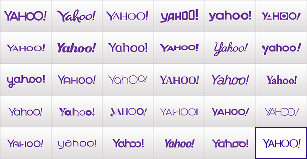
But rotating through 30 different logos comes with a cost.
- A glimpse of what could have been. While Yahoo itself is excited about the logo they picked, I’m sure users and designers saw something they liked better. It gives the audience a chance to say, “Oh, they really could have done better.” It opens the door for a critic of the company.
- Brand confusion. Will the real Yahoo please stand up? If you went to the Yahoo website any one of those days and didn’t know about the rotating logo, you’d think they had done a rebranding. And if you went to Yahoo search on Monday, Fantasy Football a few days later and then logged into that old, dust-collecting Yahoo mail account a week later, you’d think each Yahoo property now had its own version of branding.
So why does all this matter to churches? Well, I think too often, when a congregation changes its logo, the launch doesn’t go as it should. We get so excited about the work we’ve done that we start putting the new logo on things before it’s ready or finalized. Or even once it’s done we put it on some things without changing others. Then there are multiple versions of logos all over the church.
If you’re looking for a more detailed explanation of why a uniformed logo launch is important, here’s a link to a post I wrote two and a half years ago. It looked at the rollout of Caribou Coffee’s redesigned logo. Around my house, they still haven’t changed the signage.

